
Mortgage rates have been trending higher over the past year, and this spiked more recently given unprecedented events in Westminster – the announcement, and subsequent U-turn, on fiscal expansion outlined in the Growth Plan. But what does this all mean for the housing market?
Consumer financials: the house of bricks
We’re all familiar with the fable of The Three Little Pigs, but let’s work in reverse by starting with the house of bricks – in this case the financial health of UK households.
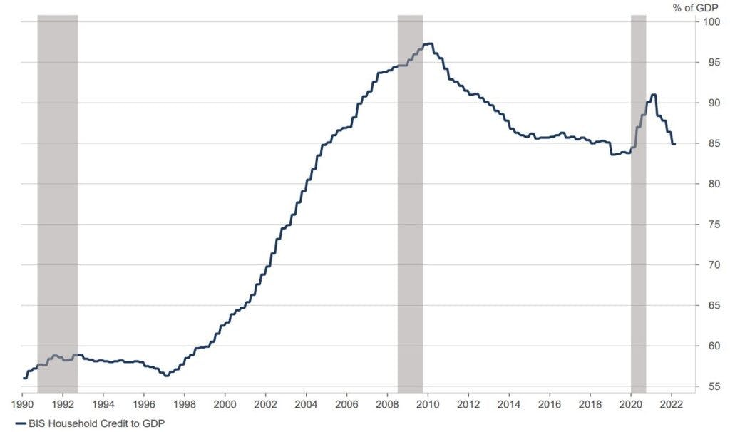
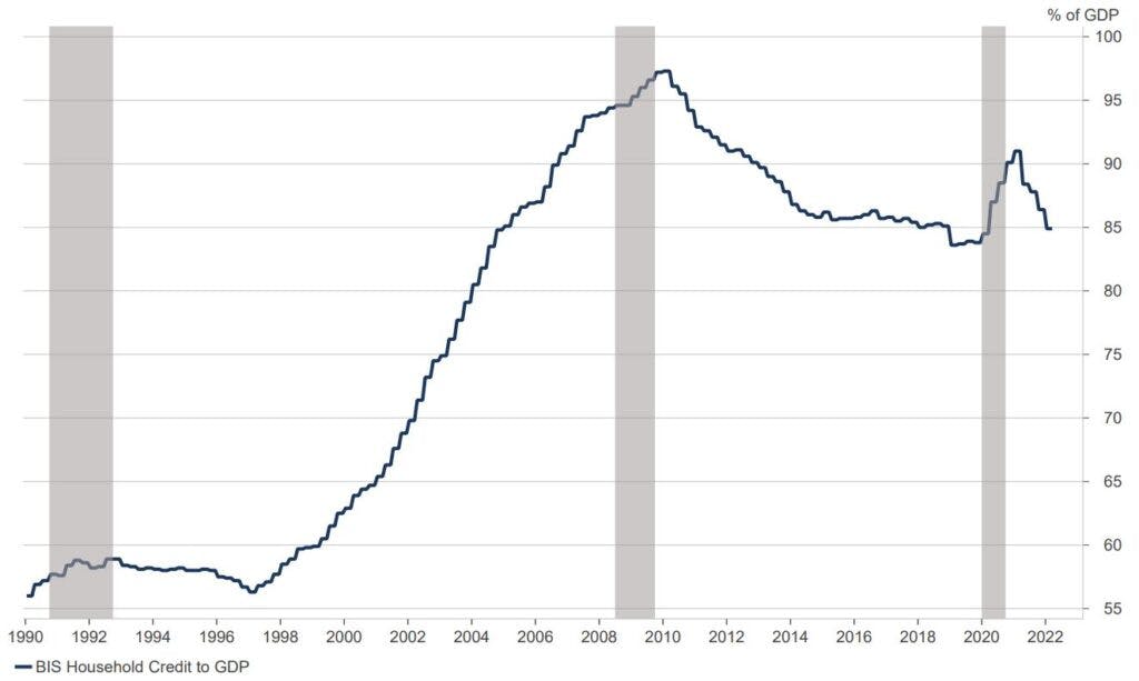
Household debt, as measured by the Bank of England, reached a new all-time high in August at an eye-watering £1.8trn. However, when we dig a little deeper and compare the size of this number relative to that of the UK’s Gross Domestic Product (GDP) – outside of the spike during the global pandemic lockdowns in 2020/21 – it has continuously fallen since the peak of the 2008/09 global financial crisis (see Chart 1), which was incidentally initially triggered by a slowdown in the US housing market.
Chart 1: UK household debt to GDP (%, 1990 – 2022)
Source: Nutmeg, ONS, BIS, Macrobond, Bloomberg
Adding in the household savings ratio – a proportion of how much income an average household saves – and we are still well above pre-Covid and global financial crisis measures (Chart 2); it appears that consumer balance sheets are indeed healthy, but it is also worth pointing out that this is an aggregate figure and doesn’t provide the whole truth especially with the cost-of-living crisis impacting many households.
Chart 2: UK Household Savings Ratio (%, 2000 – 2022)
Source: ONS, Macrobond
This is what most commentators mean when they say the consumer balance sheet is healthy. But what about the subsequent increase in interest rates this has caused?
Affordability and debt servicing: the house of sticks
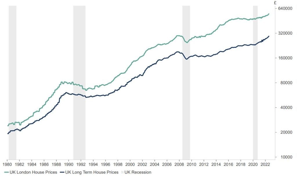
Some readers will remember a time when variable mortgage rates were well north of 10% and affordability wasn’t necessarily an issue, in part due to notably lower house prices. The peak national average house price for the UK in 1989 was £60,000; pre the global financial crisis it was £190,000; today it is just shy of £300,000 as per information from the Land Registry, with it being much higher in London (£553,000).
Chart 3: UK house prices since 1980 (£, log scaled)
Source: Bank of England, Macrobond
To reign in the elevated levels of inflation, the Bank of England has embarked on a tightening cycle by raising the base interest rate – the current bank rate is 2.25%, expected to rise again at the next meeting of the Monetary Policy Committee on 3rd November.
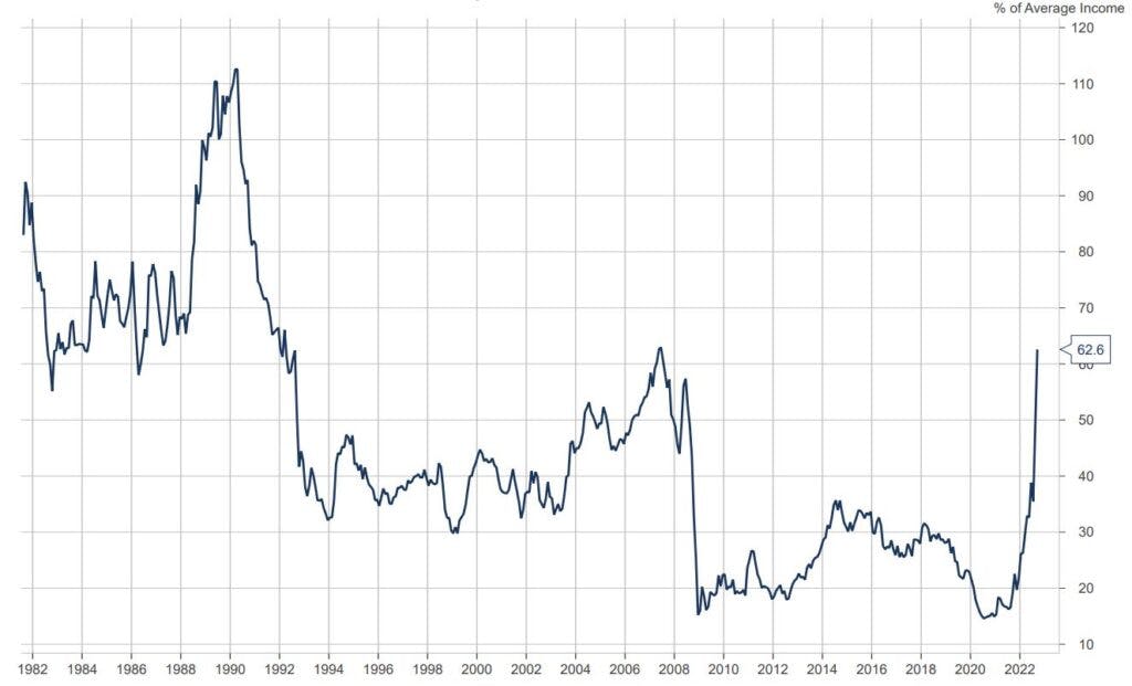
This impacts the mortgage market as the interest rates offered by lenders have increased and will front run changes the Bank of England makes. Chart 4 shows the speed of the increase in financing costs relative to the average income in the UK.
Chart 4: Percentage of average income needed to finance a house purchase in the UK
Source: Nutmeg, Bank of England, Rightmove, Macrobond
For any new home buyers (or those refinancing), they will be paying 63% of the average income, this is the highest it has been since 2007; it was only higher in the early 1990s.
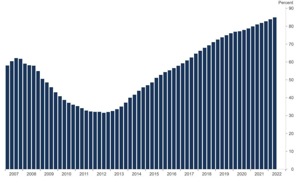
The good news is that this increase doesn’t apply to the overwhelming majority of homeowners, with many insulated (for now) on a fixed-rate mortgage compared to the early 1990s and the global financial crisis.
Chart 5 shows the evolution over time of mortgages moving from variable to fixed across the UK since 2007.
Chart 5: Share of fixed rate mortgages (%, 2007-2022)
Source: Bank of England, Macrobond
Yield and income chasing: the house of straws
The first individuals to get hit in times of stress are usually those who have engaged in what is known as a carry trade, where one borrows at low interest rates to invest in higher yielding or growing investments. This is the bedrock of property investing – and explains the historical popularity of the buy-to-let market.
The representation of buy-to-let’s in the mortgage market is a small portion (13.6%) of new mortgages underwritten in the second quarter of 2022, according to Bank of England data.
Sadly, the Bank of England doesn’t split out the refinancing mortgage data into owner-occupier vs buy-to-let, so we don’t know the proportion of investors who took advantage of low rates during 2020-2021. We do know from various surveys of investors and mortgage brokers the five-year fixed rate has been the preference.
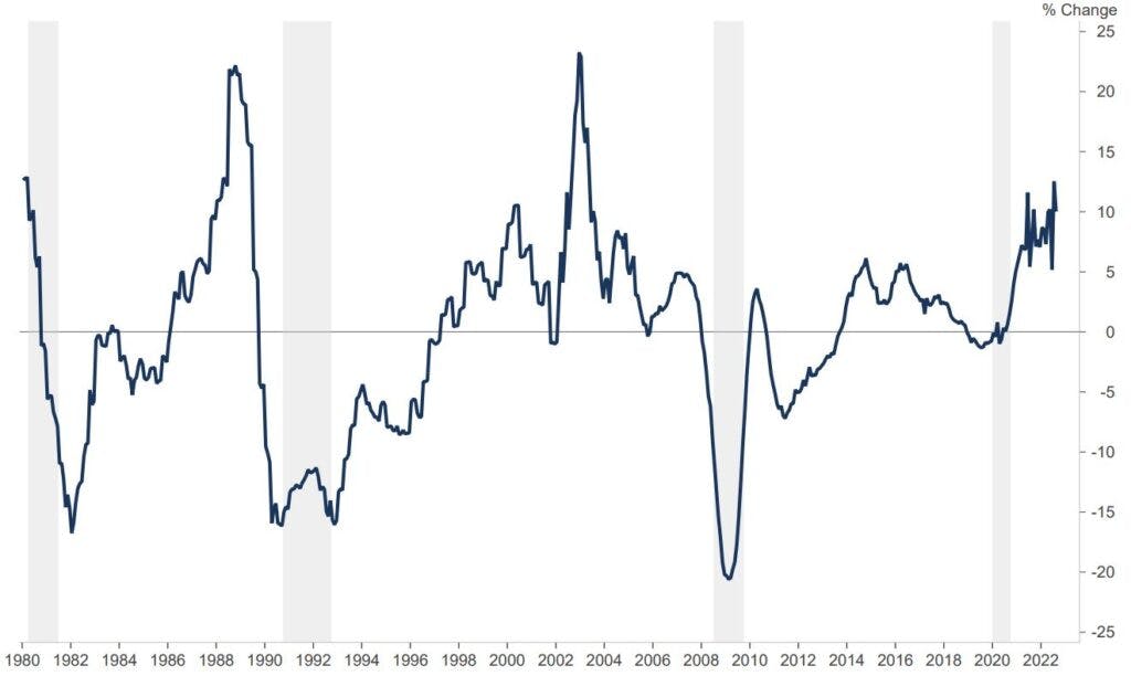
Given the evolution of the mortgage market, it makes sense to look at the changes in house prices relative to a longer-term fixed rate to paint the potential picture for UK house prices, as a larger number of households took advantage of locking low interest rates. Sadly, this isn’t painting a happy picture for the outlook of the market.
Chart 6: Real UK house price appreciation (house prices year-on-year for 5-year fixed rate – 75% loan-to-value)
Source: Nutmeg, Bank of England, Macrobond
This has a knock-on effect on ‘equity’ in a property. If you recall in Chart 5, there was a steady decline in fixed rate mortgages post the global financial crisis as households transitioned to the variable rate due to the equity erosion that took place, thus increasing their costs.
How this impacts Nutmeg portfolios
Nutmeg portfolios do not have direct exposure to UK residential property or the real estate sector generally. We invest via ETFs, which cannot hold physical property, with a lack of ‘liquidity’ in the sector (the prolonged time it takes to buy and sell) making it a difficult asset class to invest in.
We do however have exposure to UK house builders and the mortgage lenders, via the holdings we have in the FTSE 100 and FTSE 250 indices. We are watching the housing market very closely and will continue to monitor developments in the UK and globally. We will adapt portfolios accordingly should the situation change.
Risk warning
As with all investing, your capital is at risk. The value of your portfolio with Nutmeg can go down as well as up and you may get back less than you invest. Past performance is not a reliable indicator of future performance.
