Is the UK really the sick man of Europe?

Brad Holland
8 min

From pubs to publications, bashing the UK economy is a beloved national sport. But how justified is this collective pessimism? We examine a range of metrics – many of which show a rosier picture.
At a glance
- Productivity is a useful headline measure, but it can't give an accurate picture of an economy on its own
- This is because services productivity is difficult to measure, which impacts service-based economies such as the UK more than others
- The UK has relatively strong wage growth, healthy population dynamics and good connectivity to foreign markets - all factors which indicate a positive outlook
The UK has a glorious history of being dubbed the “sick man of Europe”, a diagnosis dating back to the industrial relations strife in the 1960s-70s. This chronic condition allegedly flared up again in the decade prior to COVID, where the UK underperformed its main European peers in the output-per-hour stakes - an important measure of how productive the labour force is (Chart 1 below).
Indeed, on this productivity basis alone, the perception of the UK as Europe's economic dunce may be justified. As the chart below shows, although France has actually been the chief labour productivity laggard since COVID, the UK has still lagged other leading economies.
However, more detailed analysis reveals a more nuanced - and indeed healthier - picture. Here, we look in depth at how the UK economy is faring.
There's more to smile about than the papers would have you believe.
Chart 1: Output Per Hour Worked (Seasonally Adjusted), Index 2010 = 100
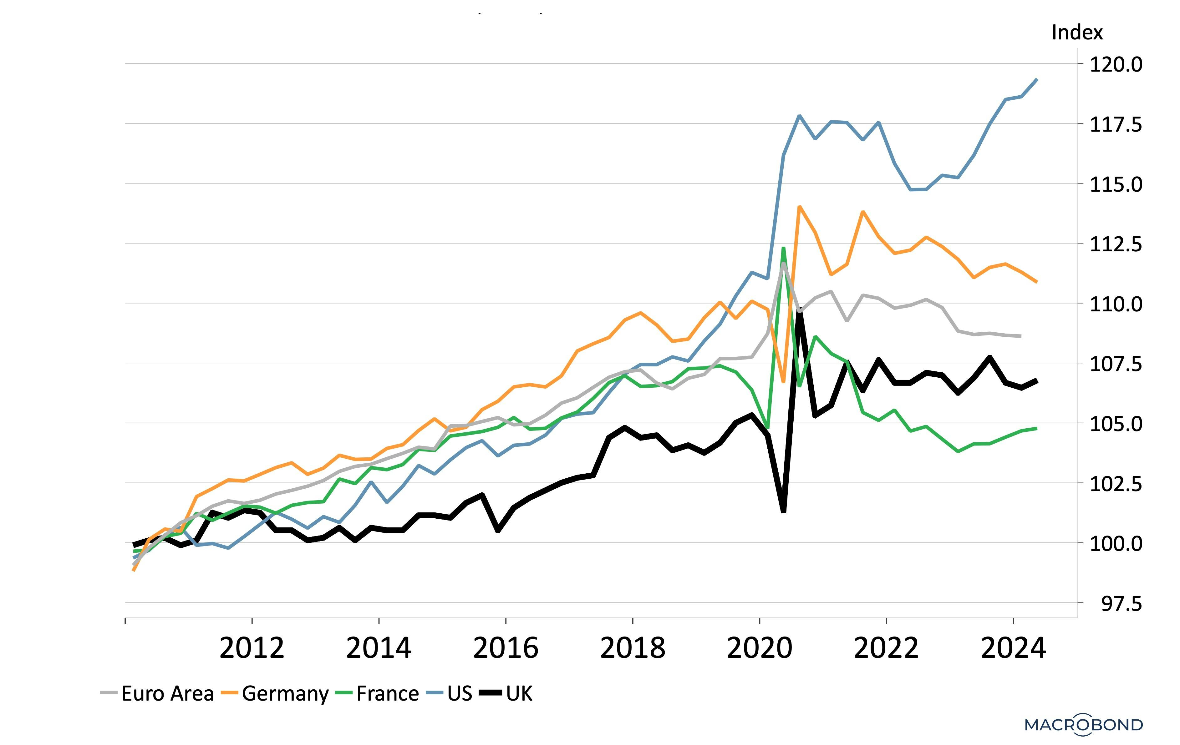
Source: Nutmeg calculations, Macrobond (September, 2024). Note: this is an indexed chart in which all regions shown start at the value of 100 in 2010, allowing us to compare relative growth against this common baseline. It is also seasonally adjusted, meaning it controls for seasonal effects in the data and allows for long-term trends to be identified.
What's important to understand is that the labour productivity (output-per-hour) metric above should not be considered in isolation when assessing economic health. Namely, because nobody agrees on how to measure services sector productivity.
This is a major obstacle in comparing economies with differing industrial and services sector bases, with services-dominant countries such as the UK potentially left unfairly penalised.
To get a more holistic picture, we look at long-term productivity, wage growth, demographics and global connectivity - which together reveal a Britain that is, in many ways, pretty Great.
How does the UK economy really measure up against its peers?
The US has long been considered the ‘gold standard’ for economic performance with its ultra-competitive capital, labour and product markets; vast wealth; and entrepreneurial spirit.
While still imperfect, GDP per capita remains, in our view, the better measure when comparing productivity between countries as it is a broad measure. Chart 2 shows that, while trailing the US, the UK comes out on top among the major European economies when looking at both long-term growth and growth-per-capita terms over the last 30 years.
Chart 2: Historic Average Annual Real GDP Growth (%) - US and UK (1995 - )
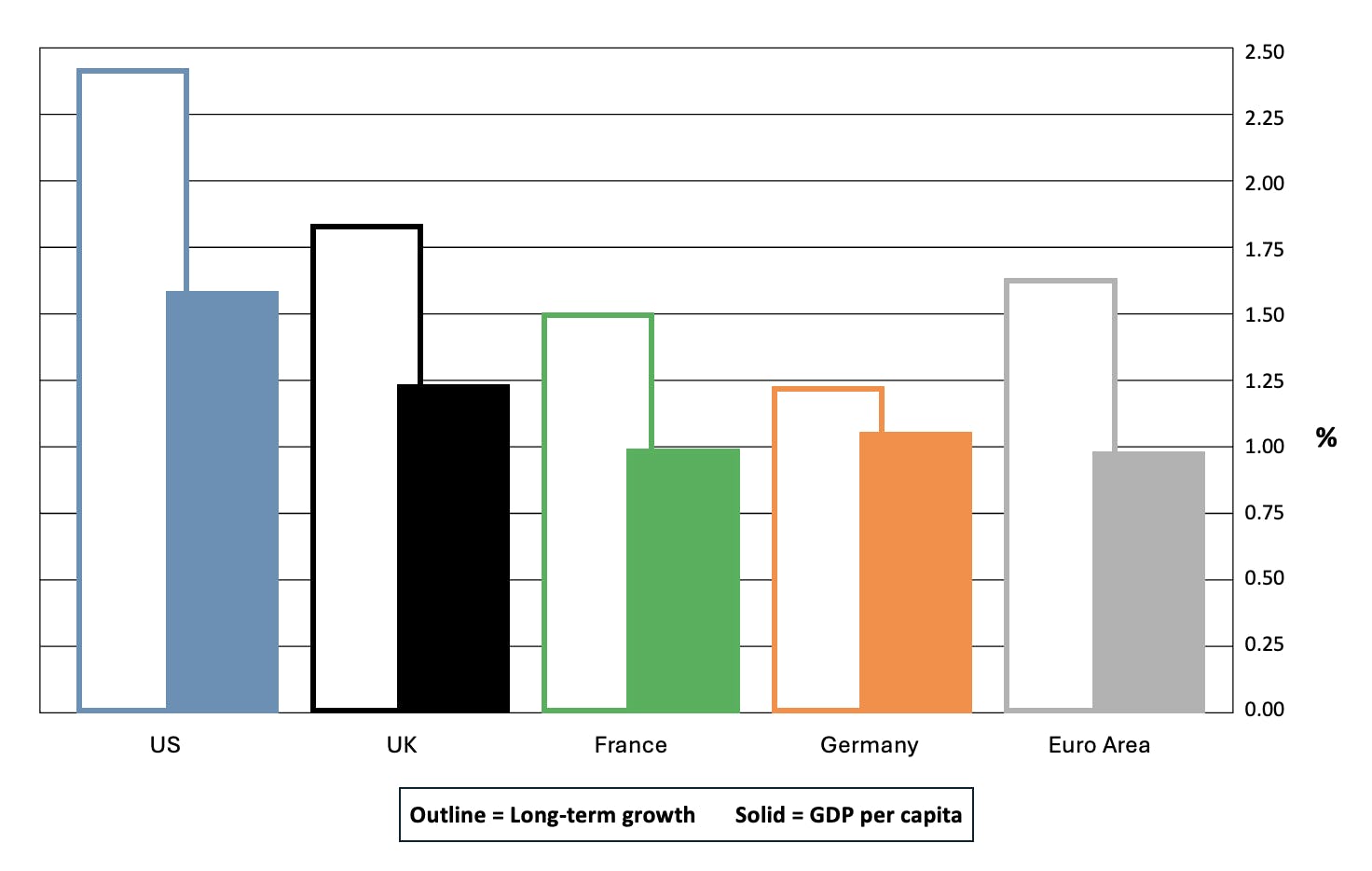
Source: Nutmeg calculations, Macrobond (September, 2024).
If the UK is doing relatively well, why all the bad press?
As mentioned, the decade prior to COVID was not good for the UK’s output per hour metrics. The rot set in after the Global Financial Crisis of 2007/8, which caused investment to slow dramatically in the UK (as seen in the green line in Chart 3 below).
Chart 3: UK Output Per Hour Worked and Gross Fixed Capital Formation (Seasonally Adjusted)
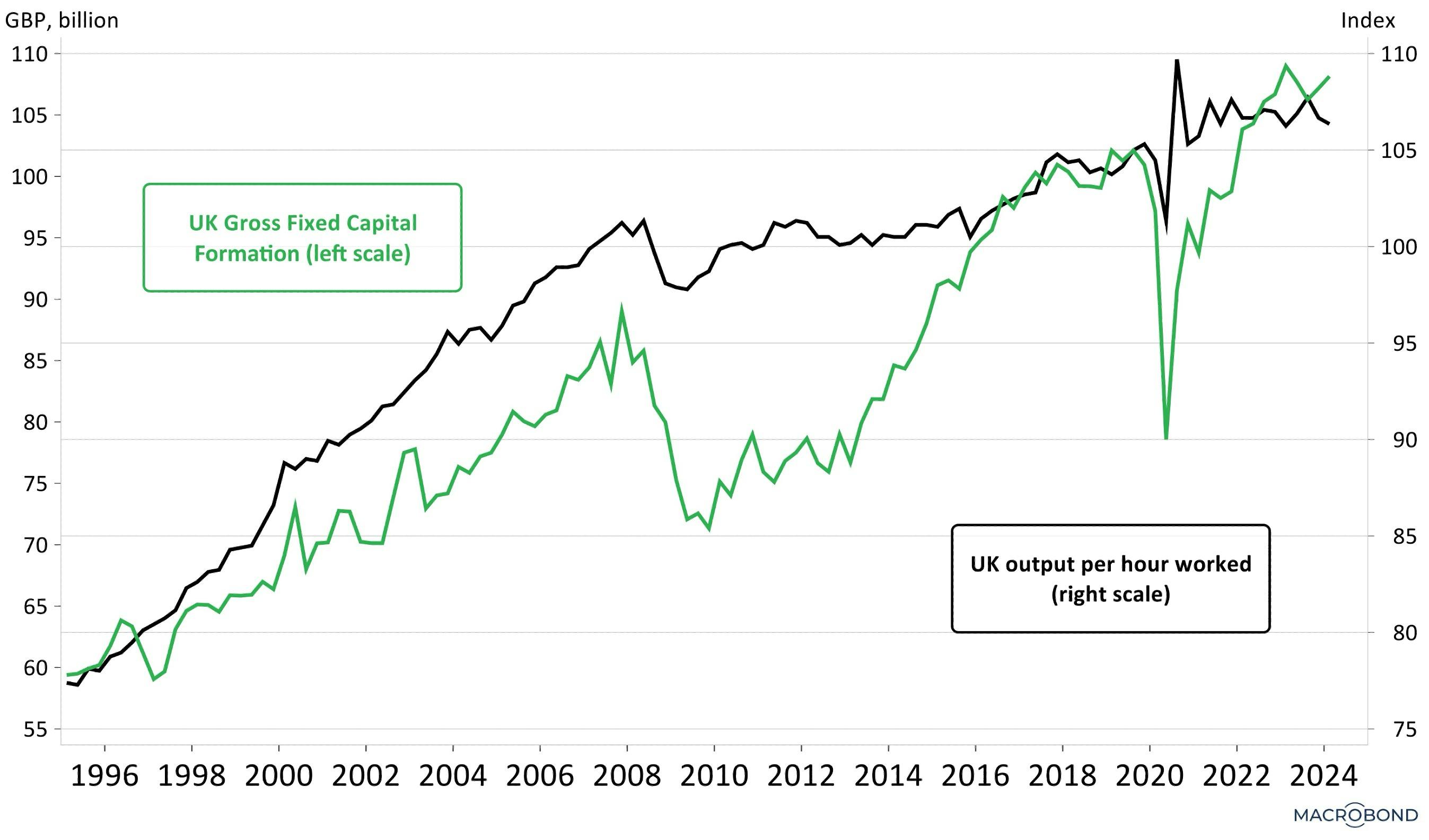
Source: Nutmeg calculations, Macrobond (September, 2024). The data is seasonally adjusted, meaning it controls for seasonal effects in the data and allows for long-term trends to be identified.
Clearly, Brexit has also been a major shock to the way business is done in the UK. This, coupled with the impact of the COVID shutdown, explains the output drop in 2020. Any shock can dampen productivity temporarily until producers fully adapt.
This chart shows that, as a trend, output per hour worked (black line) is linked to investment levels (gross fixed capital formation, green line) in that they both tend to track up and down in sync. As can be seen, investment levels have improved since the Global Financial Crisis and have outpaced output (productivity) since 2022, suggesting productivity will also improve. While we must remember that the UK is a predominantly services economy in which accurate measures of productivity are simply not available, the improved investment data seen in the above chart are a good sign of adaptation to the multiple shocks faced by UK companies over recent years.
Beyond productivity, how else can we gauge relative economic health?
Three other gauges boost our belief that the UK will remain healthy in the long term: strong wages growth, a robust population, and connectivity to other countries.
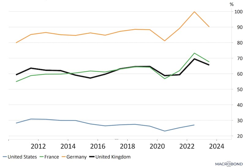
1. Wages growth
As a mainly services-sector economy, corporate cost bases and profit margins are more sensitive in the UK to wages growth than they are in a goods export-oriented economy like Germany. Chart 4 shows that the UK labour market is working better for workers than the US, France and Germany in this measure. Wages growth, when kept in check, boosts the economy as it increases spending power.
Chart 4 - Wages Growth is Doing More for UK Workers
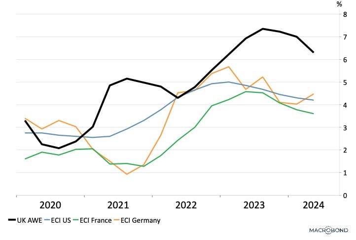
Source: Nutmeg calculations, Macrobond (September, 2024). ECI is Employment Cost Index, AWE is Average Weekly Earnings.
2. Demographics: Population projections
The resilience of a country's economy is of course strongly linked to its population. Population growth means growth in both labour supply and consumer demand, as well as the investment opportunities generated by the need to sustain a growing population. However many developed nations face the same problem; how to maintain economic performance with declining populations.
In this, the UK has better population dynamics than Germany and France, and is not forecast to shrink below current levels in the next 75 years (though falling late in the period), according to United Nations demographic projections (Chart 5).
Chart 5: Population Projections
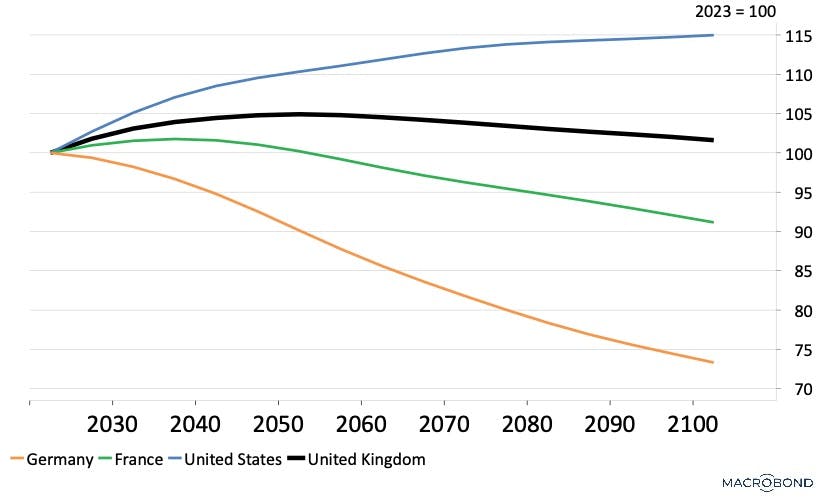
Source: United Nations, Macrobond (September, 2024). Assumes constant fertility and constant mortality rates. Data is grouped into five-year intervals. This is an indexed chart where 2023 is equal to 100. It shows total populations as 100 on the left, and how they are projected to grow or shrink over time.
When it comes to ageing populations, the UK's outlook is also more promising than its European peers. Shown in Chart 6 as a ratio of population over 65 to population 20-64, the UK has relatively more people in age brackets likely to be in the workforce versus those associated with retirement.
Chart 6: Old-Age Dependency Ratio
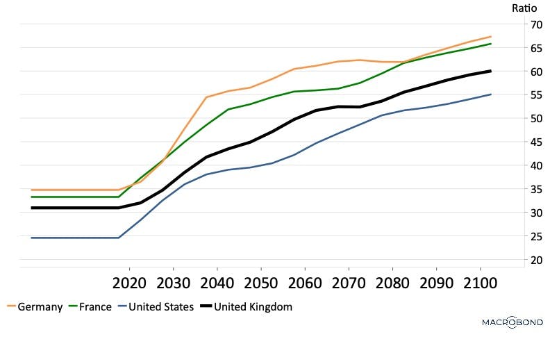
Source: United Nations, Macrobond (September, 2024). Old-age Dependency Ratio is calculated as the ratio of population aged 65+ per 100 people aged 20-64. Assumes constant fertility and constant mortality rates.
3. Connectivity
A key factor in an economy’s prospects is its connection with the rest of the world. Economies without international connectivity tend to be less efficient, less competitive and less innovative. Connectivity between countries is achieved through trading relations, involvement in international finance, and global freedoms.
Trade connectivity:
The chart below shows that the UK as an economy has good "connectivity". The chart shows the proportion of the UK's GDP that comes from trade in goods and services with other nations - as opposed to other components like consumption and investment - and can be seen as an indicator of the extent to which the UK is "open for business". The below shows the UK's connectivity to be higher than the US but lower than Germany. It's about on-par with France.
Chart 7 - Trade Share of GDP
Source: World Bank, Macrobond (September, 2024).
Financial connectivity:
Here the UK punches well above its economic weight - and there are two ways to show this.
Firstly, we look at the market capitalisation (value of public company stocks) as a percentage of GDP. Chart 8 below shows that UK equity market capitalisation is larger than comparable European economies as a percent of GDP.
While the rise of “growth stocks” in the last decade has led to diverging trends between the UK and US equity market valuation as a share of GDP, the higher ratio indicates the greater importance of equity finance in the UK relative to Germany and France.
Chart 8 - Equity Market Capitalisation as a % of GDP

Source: Nutmeg calculations, Macrobond (September, 2024).
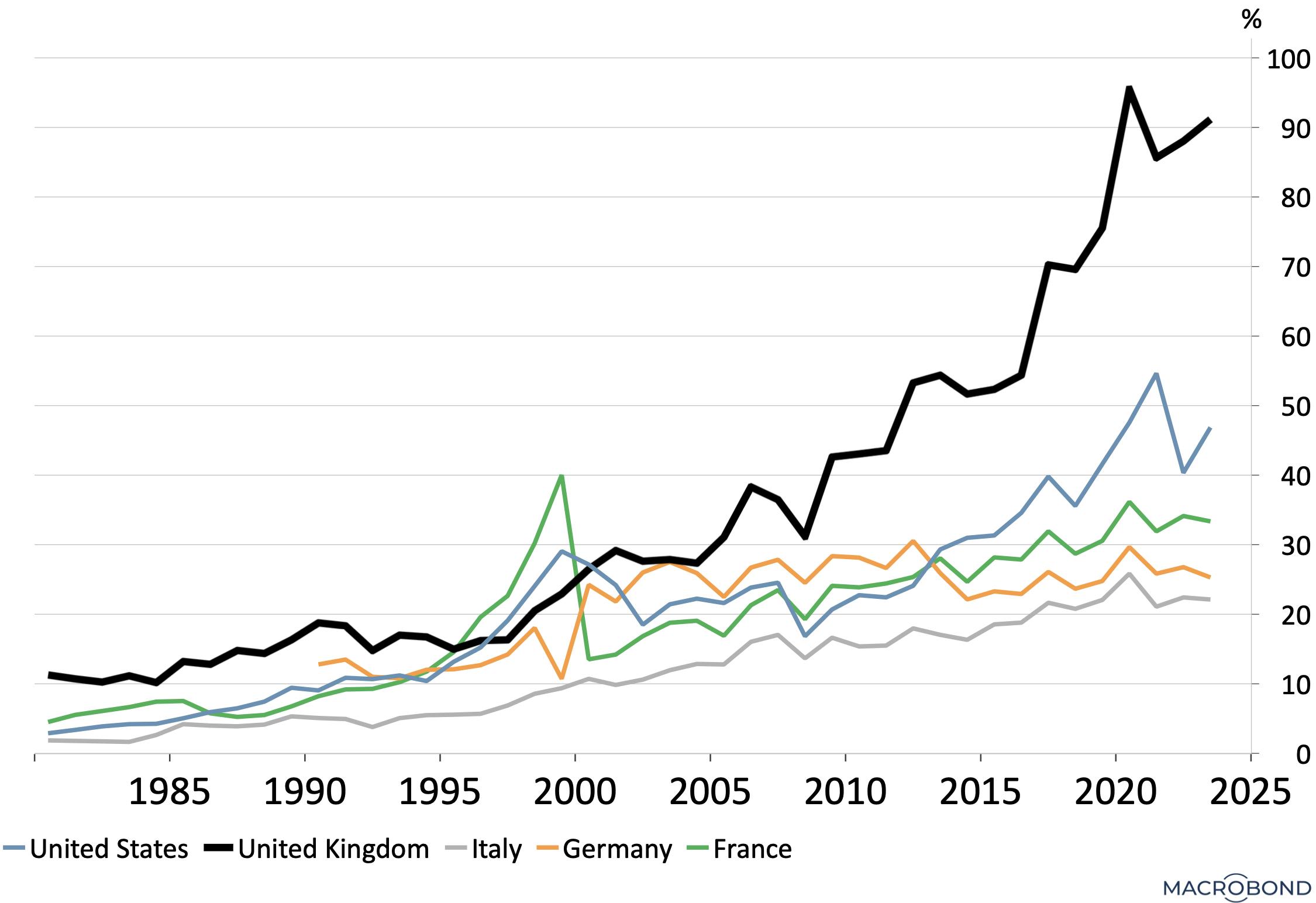
Secondly, we look at the involvement of the UK, US and Euro area in international finance, measured with respect to annual economic output (GDP). The green line in Chart 9 below shows that the amount of business that the international community conducts in the UK dwarfs the UK's actual economy. As can be seen, the international liabilities plus assets of the UK are ten times the size of annual GDP, significantly higher than that of both Europe and the US.
This reflects the UK’s role as the “middle-man” of much global trade and finance. It reflects the diversified nature of income generation within the UK economy, and the benefits from the finance sector in London and Edinburgh, in particular.
Chart 9 - Gross International Balance Sheet Position
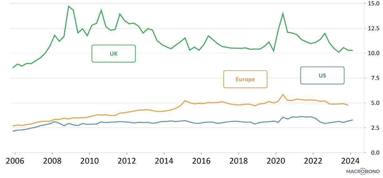
Source: Nutmeg calculations, Macrobond (September, 2024). This Y axis indicates a multiple of GDP.
Foreign interest:
The above point is driven home all the harder by a look at foreign direct investment.
Foreign direct investment refers to an investment made to acquire a lasting interest in a company or project operating outside the investor's economy. As a percentage of GDP, the level of foreign direct investment into the UK is world leading, and reflects a perception of UK business practices as attractive.
Chart 10 - UNCTAD, Foreign Direct Investment (Inward) % of GDP
Source: Nutmeg calculations, Macrobond, United Nations Conference on Trade and Data (calendar year 2023).
What does this all mean for investors?
While the Prime Minister has vowed to 'fix the foundations of the British economy', the data would indicate that those foundations are relatively solid already.
Nutmeg's portfolios contain a larger share of UK equities than the share of UK stocks in our comparator global equity index. This "home bias" is a common feature in investing. A UK home bias is also consistent with the relatively favourable findings of our analysis here.
Risk warning
As with all investing, your capital is at risk. The value of your portfolio with Nutmeg can go down as well as up and you may get back less than you invest.
Past performance and forecasts are not a reliable indicator of future performance. We do not provide investment advice in this article. Always do your own research.